Using your logo consistently increases the chance of becoming more recognisable thus creating a memorable visual identity. But what happens when you have to stretch, crop or resize your logo to fit something? That’s why instead of damaging your visual identity, most convenient option is to have both a primary and secondary logo.
Primary Logo
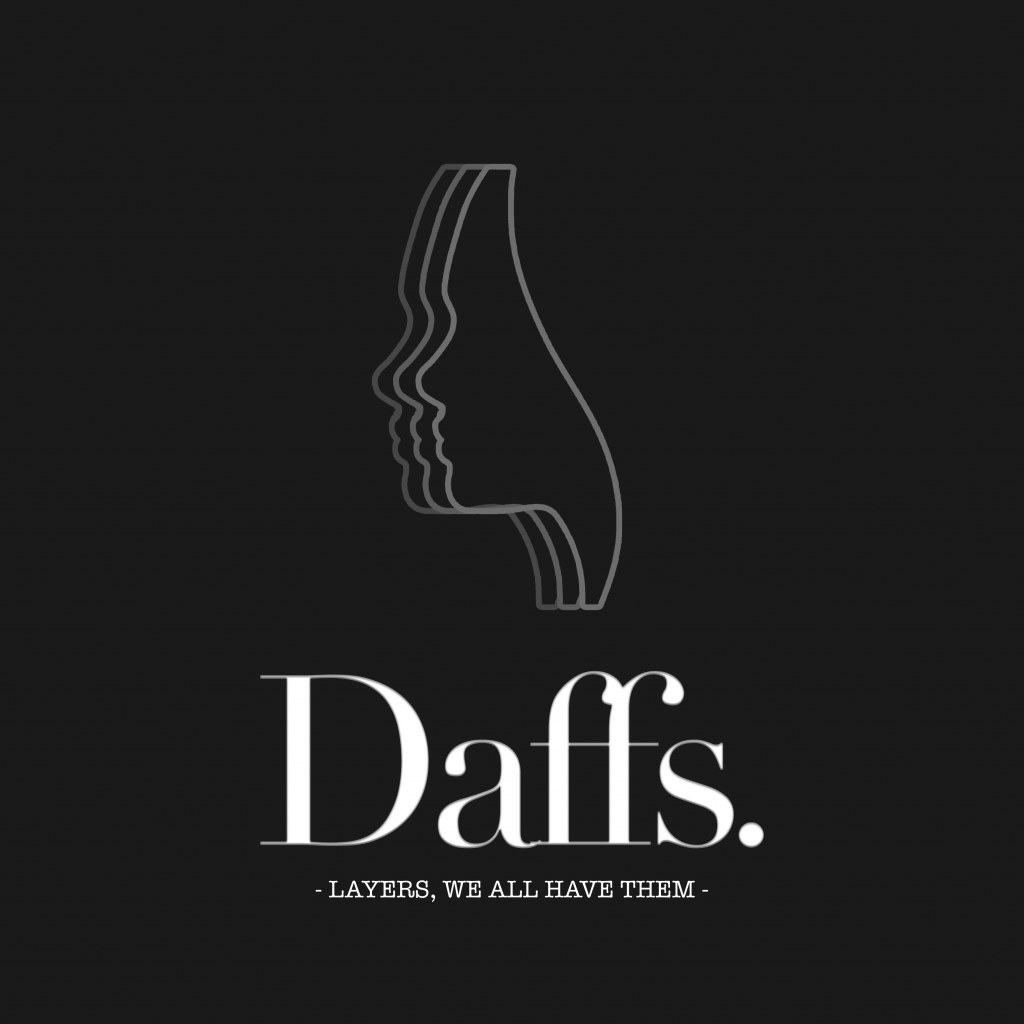
Your primary logo is your main logo. It will most likely consist of your business name, a slogan & an icon/illustration. This will most likely be used on the front page of website headers or front side of a business card.
Here are a few examples of primary logos that I created for past clients:


Secondary Logo
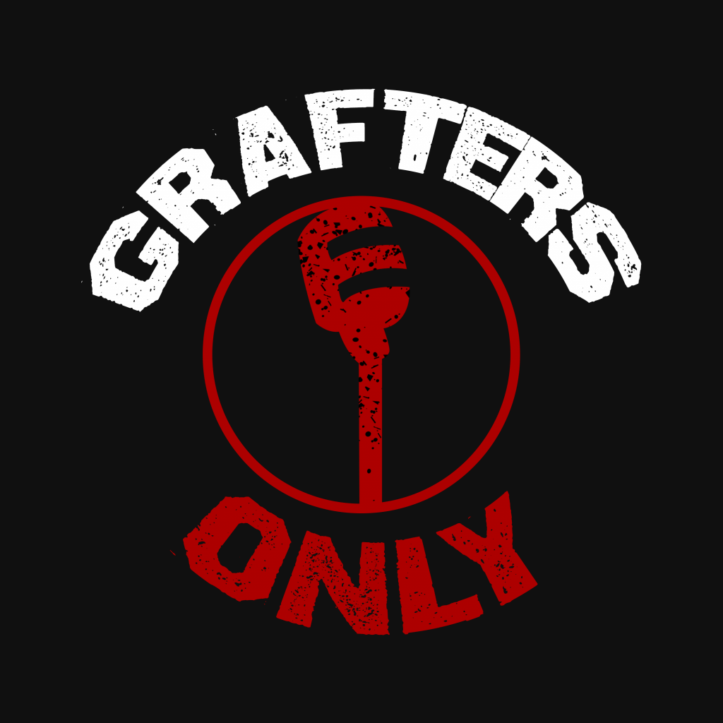
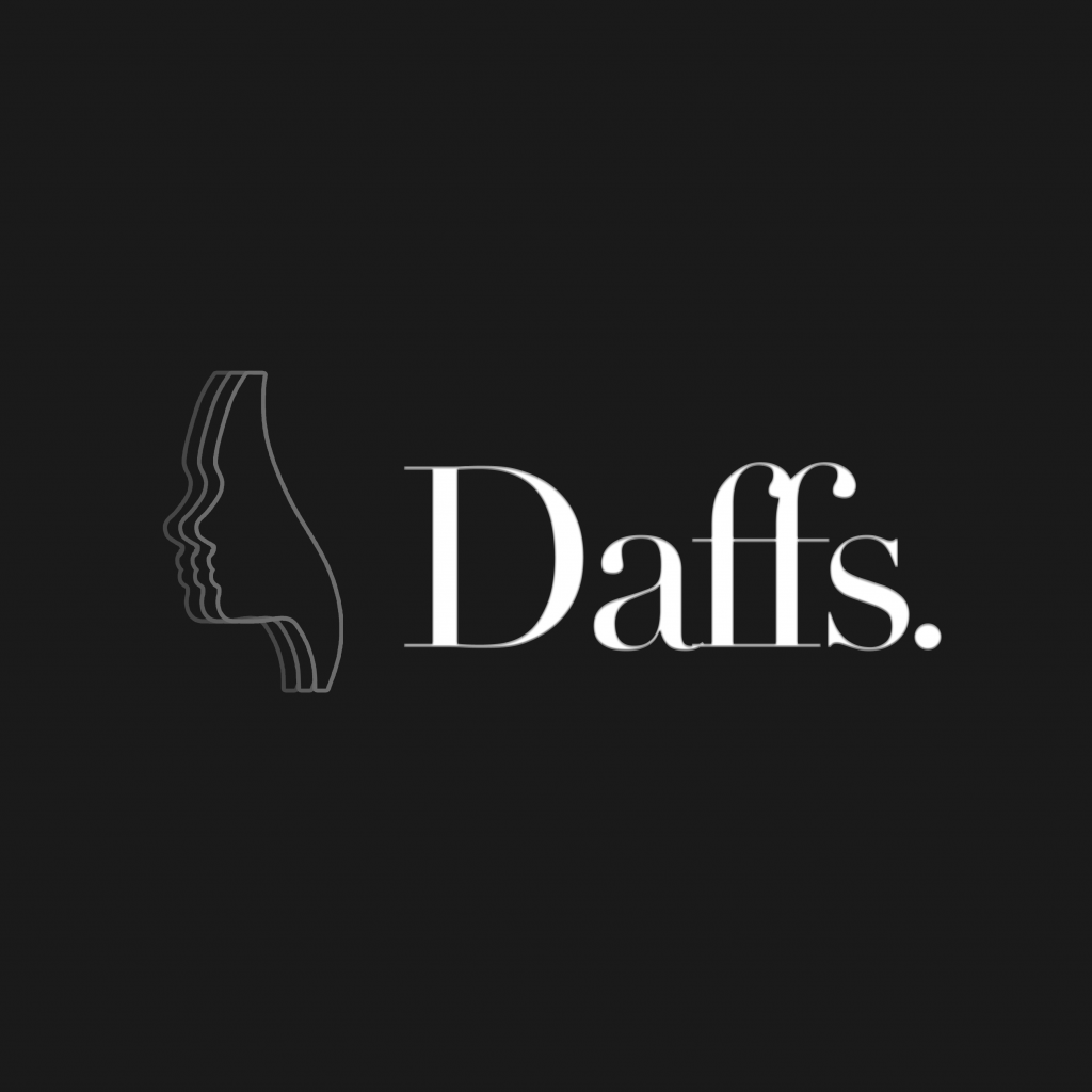
Your secondary logo would be the alternative logo you would use. it consists of the brand’s name, slogan & and icon/illustration just like the primary logo – it would also be consistent with the primary logo by using the same elements.
Below are the secondary logos that I created to go with the primary logos above.

When to use what?
Unless you are a well-established brand that people will recognize straight away (McDonald’s, Nike, etc.) then you should use the primary logo so people don’t get confused.
But that doesn’t mean the secondary logo is useless – they’re actually great for social media. It helps to provide your logo with more flexibility for different design scenarios, like needing a more compact version of your logo to fit in your Instagram display picture or a sticker. Or you may need a version with more width so you can add it to your header.


